I CREATE BRANDING for businesses both established and new, and I find ways to apply that branding, from the usual to the unique. I'm also happy to design new items based on existing branding, whether or not I'm the original designer.
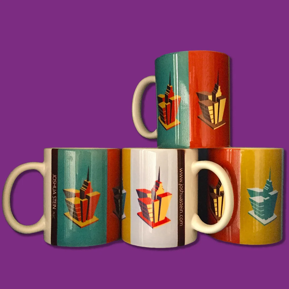
joshua stein pllc
JOSHUA STEIN PLLC is a real estate attorney in New York City. Before he announced the establishment of his firm in 2010, he hired me to create his corporate identity.
In the initial design phases, I presented a logo design in 4 different color combinations. Rather than be limited to one combination, Stein decided to go with ALL of the color combinations! I've had a lot of fun, having been given lots of design freedom as well as a wide variety of design projects.


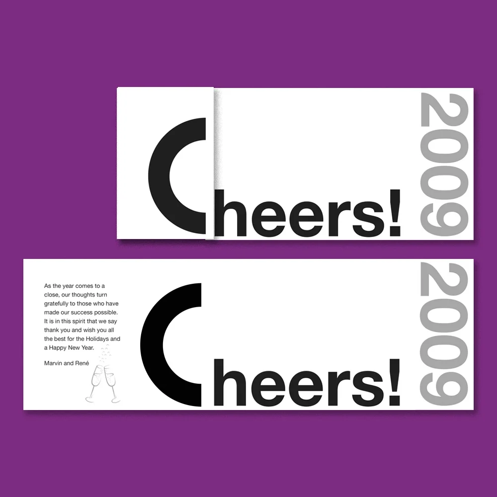
clawson architects
Although I did not design CLAWSON ARCHITECTS' very striking and elegant logo, I've been privileged to incorporate it into a wide variety of items for the firm.
My graphic design work with Clawson includes business collateral (business cards, letterhead, envelopes, labels, note pads and sketch pads) as well as a series of holiday cards and announcements, and most recently, a complete re-design and re-implementation of their website.


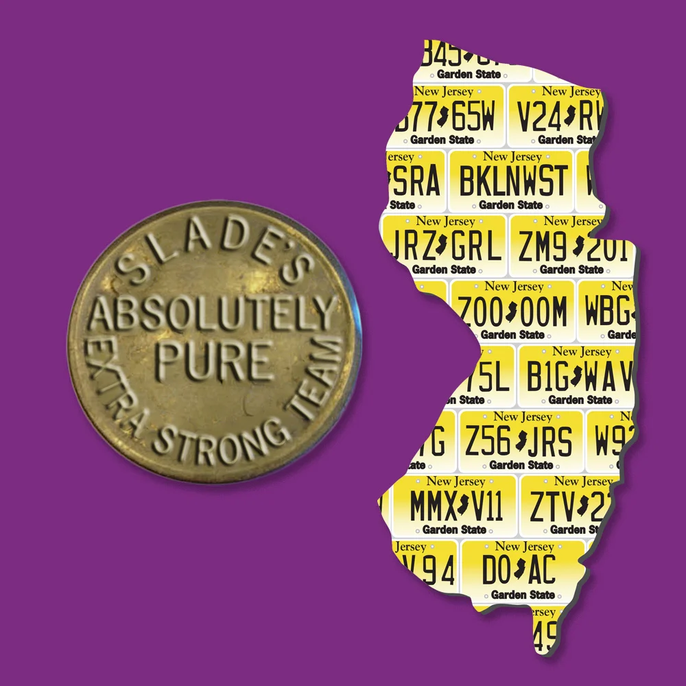
Mark Slade Real Estate
Mark always brings me interesting projects: "Can you make my logo look like a corn maze seen from an airplane?" or "the emblem on the back of this old truck say 'Maplewood'?" or "make the words of this banner ad look like they're in the NYC subway?" And I love to take him up on the challenge!


APPSOLUTE MARKETING


This company provides Mobile apps for small business, and the owner wanted its brand to look "cutting edge", but also flexible, and approachable. I created both a logo and an icon for multiple platforms and purposes. The icon employs a version of a map "pin" to reinforce the idea of finding one's way to a new place in the digital world.

thomson blueprints for living
This was a re-branding for a professional organizer, whose business had previously been know as Creative Organizing, and whose old logo consisted of an abstract arrangement of squares. The owner wanted a friendly yet professional and upscale new logo.
Despite the presence of the word "blueprint" in the business's new name, the business owner was adamant about not wanting to incorporate blueprint imagery. Instead, we focused on a subtle image of balance, new growth and transformation, and this logo is the result.


aileen binder landscape design
Aileen Binder came to me with an idea: She wanted a graphically strong business logo based upon the Fibonacci spiral.
The Fibonacci spiral, also known as the Golden Ratio, is commonly found in nature, and it's applied in landscape design (and in art) as the basis for creating pleasing proportions. I added an arc of leaves and an elegant but simple rounded font to complete the design.
The business card and sign Incorporate squared elements in black, white and grey to echo the squares and rectangles surrounding the spiral. Aileen reports that she gets frequent compliments when she plants her sign in her clients' yards.

GROUND WORK
I created business cards and a website for this client, whose mission is to help save our environment, and whose tag line is “rooted in sustainability”. The cards are printed on FSC-approved stock.
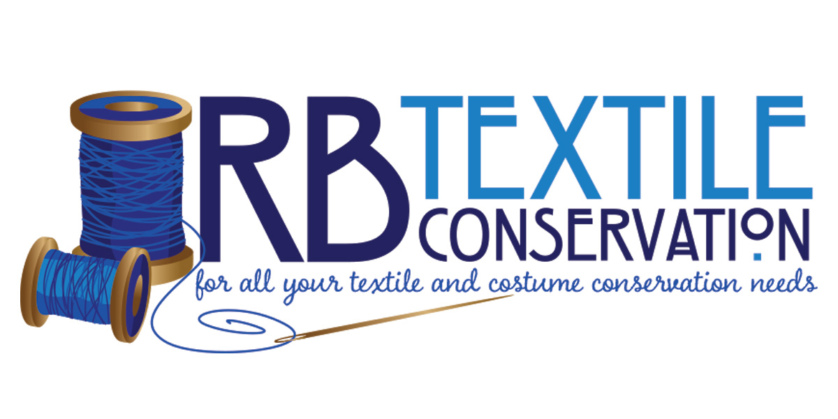
RB textile conservation
I created this logo for a private textile conservation business. The client wanted something classic (but friendly) in multiple shades of blue, incorporating a needle and thread.
Along with an image of wooden spools of thread and a golden needle, I incorporated Arts & Crafts style text contrasted with a friendly script for the business tagline.

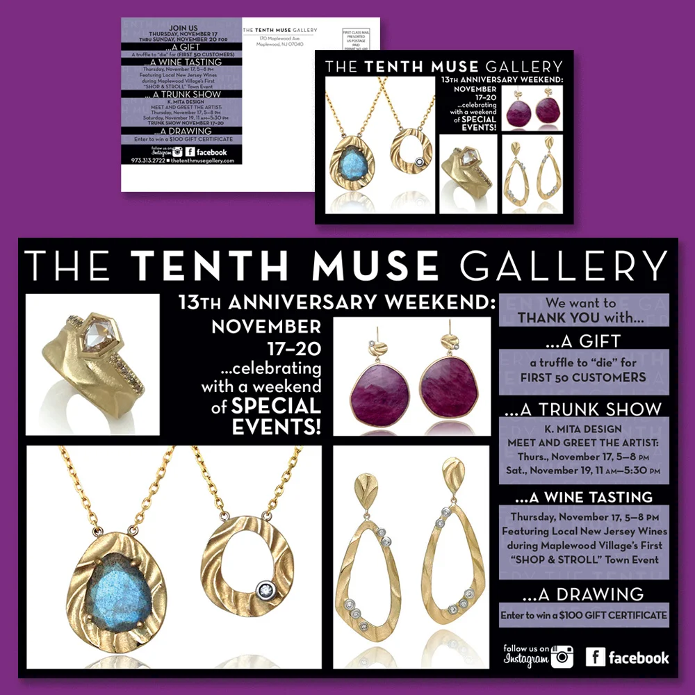
The Tenth Muse Gallery was a retail business in downtown Maplewood. In 2011, the shop moved to a new location, and at that point, I rebranded the business with a new logo, new business collateral, new ad and postcard layouts and new product packaging.


ml Framing
This client already had a playful, professionally created logo: Mona Lisa holding a frame and the distinctive arrangement of the company's name. My task was to incorporate this artwork within an expanded color palette in new business cards and labels, and also to provide an icon to be used in gift certificates.